LC Journal Color Coding
Fifteen pen roles, one legend, eight languages, four scripts — starting with the six that do the work.
A working notation for a handwritten language journal: fifteen pen roles plus pencil, one legend, used unchanged across eight languages in four scripts. Unlike the other systems documented in this section, this is not a scholarly standard with a maintaining body — it is an in-house convention, published here because the design problem it solves is a common one and the solution generalises. Adapt it, or take the structural rules and build your own.
The key, before anything else
Six pens carry an ordinary page. The full legend below runs to fifteen roles plus pencil, and it is worth having, but nobody adopts a fifteen-colour system by reading about it first. Start with these six, use them for a fortnight, and add a role only when you catch yourself needing one that is not there.
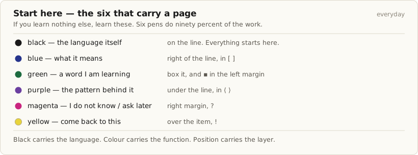
| Ink | Means | Where it goes | Mark |
|---|---|---|---|
| black | the language itself | on the line | — |
| blue | what it means | right of the line | [ ] |
| green | a word I am learning | box it | ▪ left margin |
| purple | the pattern behind it | under the line | ⟨ ⟩ |
| magenta | I do not know / ask later | right margin | ? |
| yellow | come back to this | over the item | ! |
That is the whole system at working scale. The rest of this page explains why each colour sits where it does, gives the full fifteen-role legend for when you want it, and adapts the same six to the writing systems of eight languages without ever changing what a colour means.
The rule the whole system runs on
The whole design reduces to one sentence: black carries the language, colour carries the function, position carries the layer. Almost everything you write goes down in black; the coloured pens mark, label and annotate what is already there. A headword is black text inside a green box, not green text. An example sentence is black text with an orange bracket beside it, not an orange sentence. This single decision is what makes a fifteen-colour legend survivable — it keeps the page legible and it keeps the colour count off the writing hand.
The second rule follows from the first: you work in passes, not in sentences. You do not switch pens mid-clause. You write the page in black, then go over it again with one pen at a time — reading aids, then meaning, then structure, then the open questions. Correction happens on a different day entirely, which is what makes it diagnostic rather than cosmetic.
The third rule is what keeps the system accessible: colour is never the only carrier of meaning. Every role also has a glyph, a fixed page zone, or both. A photocopy of any page in this system stays fully readable, and the two most common colour-vision limitations do not collapse any pair of roles that share a page zone.
The master key

The everyday ten
An ordinary page needs these ten and nothing else, and most pages use six. The advanced roles exist for precision work — phonetic contrast, exception-hunting, register — and introducing them early is the most reliable way to abandon the system.
| # | Ink | Means | Where on the page | Mark |
|---|---|---|---|---|
| 01 | black gel | the language itself | on the line — the default draft | — |
| 02 | blue gel | English meaning | right of / under the line | = [ ] |
| 03 | green gel | headword being learned | box around it + left margin | ▪ |
| 04 | purple gel | grammar pattern | pattern box + underline | ⟨ ⟩ |
| 05 | turquoise gel | romanisation / reading aid | ABOVE the line | position |
| 06 | red gel | correction | caret at the error, repair in the margin | ^ ✗→ |
| 07 | magenta gel | open question | right margin | ? |
| 08 | orange fineliner | attested input | bracket beside the block | → |
| 09 | burgundy gel | produce something | box, bottom third | ✎ |
| 10 | yellow highlighter | review this again | over the item | ! |
| — | pencil | provisional / unverified | anywhere | graphite |
Three constraints hold the assignment together. Black is the default draft, so the absence of colour is itself a signal. Red is correction and nothing else — using it for emphasis destroys the one colour whose appearance means that past-you made an error. And blue is deliberately not the draft colour: it is the first-language side of the page, so it should never be what the hand reaches for first.
Simplified keys, one per language
The colours never change meaning between languages. What changes is which roles carry weight at a given level, where a role physically sits on the line, and which symbols ride inside a role. Each card below is the working subset for one language, with the single overload risk that most often kills the system for that language.
English
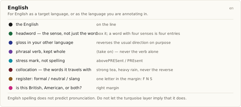
English is the one language on this list that plays two parts, and the key has to serve both. As a target language it has the section's hardest problem: spelling does not predict pronunciation, so the turquoise reading-aid layer marks stress rather than sound — PREsent and preSENT are one spelling and two words, and that is the distinction worth the ink. The green layer boxes a sense rather than a word, because an English headword with four senses is four entries and treating it as one is how a vocabulary list quietly stops being true. Burgundy carries collocation, which is where English hides most of its difficulty: strong tea and heavy rain are not interchangeable and no rule explains why. Brown marks register in a single margin letter, F, N or S, because the gap between formal and slang English is wider than most learners are warned about. And when you are annotating in English rather than studying it, blue reverses direction — it carries the gloss into your other language, which keeps the colour's meaning stable even though the traffic runs the other way.
German

Spanish

Cantonese — Traditional characters with Jyutping

Turkish

Vietnamese

Mandarin — Simplified with Pinyin

Mandarin — Traditional with Zhuyin

Esperanto — as a labelling language

What the system claims, and what it does not
Colour-coding here is an organisational and retrieval-cue tool. It makes a page scannable, it makes the shape of your own recurring errors visible across weeks, and it makes review fast enough that you actually do it. Those benefits are real and they are sufficient.
It is not a memory technique, and this page makes no claim that it is. Writing a word in green does not encode it more deeply than writing it in black, and nothing in this design depends on a subconscious or automatic effect from ink colour. What produces retention is what always produces it: spaced retrieval, comprehensible input, and forced output. The colours exist to make those three cheap enough to sustain over months.
The system also has a structural limit worth stating plainly. Fifteen genuinely distinguishable hues do not exist in an ordinary pen case, and six of the fifteen roles here depend on page zone or glyph as much as on colour. That is a design choice rather than a flaw — but it means the placement rules are load-bearing, and a user who ignores them will find the system degrades faster than a smaller one would.
Adopting it: the two-week trial
Do not adopt the legend. Test it, then cut it. A fifteen-role system you kept eight roles of is a success; a fifteen-role system you abandoned in week three is not.
- Before day one — make a swatch strip on the paper you actually use, under the lamp you actually study by. Barrel and grip colour do not tell you ink colour, and warm light flattens the reds.
- Days 1 to 14 — use the everyday ten only, across at least four languages. Keep the legend card visible; do not try to memorise it.
- On every page — put a pencil tick in the corner for each role you used without having to think about it.
- On day fifteen, prune. Any role you had to look up more than twice in two weeks is not a role — it is a lookup table. Cut it, or merge it into its nearest neighbour.
- Two roles you keep confusing are not two roles. They are one role plus a distinction you do not yet make; merge them and reintroduce the split when you feel its absence.
- A role you used on every single page may have become decoration. If it is on everything, it distinguishes nothing.
- Fewer than six roles surviving is a good outcome. Six roles used fluently beat fifteen consulted.
One rule is specific to the scaffolding roles. Turquoise reading aids come off a word after three consecutive sessions of reading it correctly unaided; if you then fail it, that is a highlight and a place in the next drill, not a reason to write the ruby back in. Yellow highlight clears after the item survives two review sessions clean.
Related
- What to Highlight While Reading — The same six colours, applied to a text somebody else wrote.
- The International Phonetic Alphabet — The default phonetic notation for role 11 on this page — read it first.
- extIPA — Extensions to the IPA for Disordered Speech — Used in this system only for a documented need, never as a default.
- X-SAMPA — An ASCII correspondence for typing, not a handwritten notebook system.
- Notation Systems hub — The scholarly transcription standards this page sits alongside.